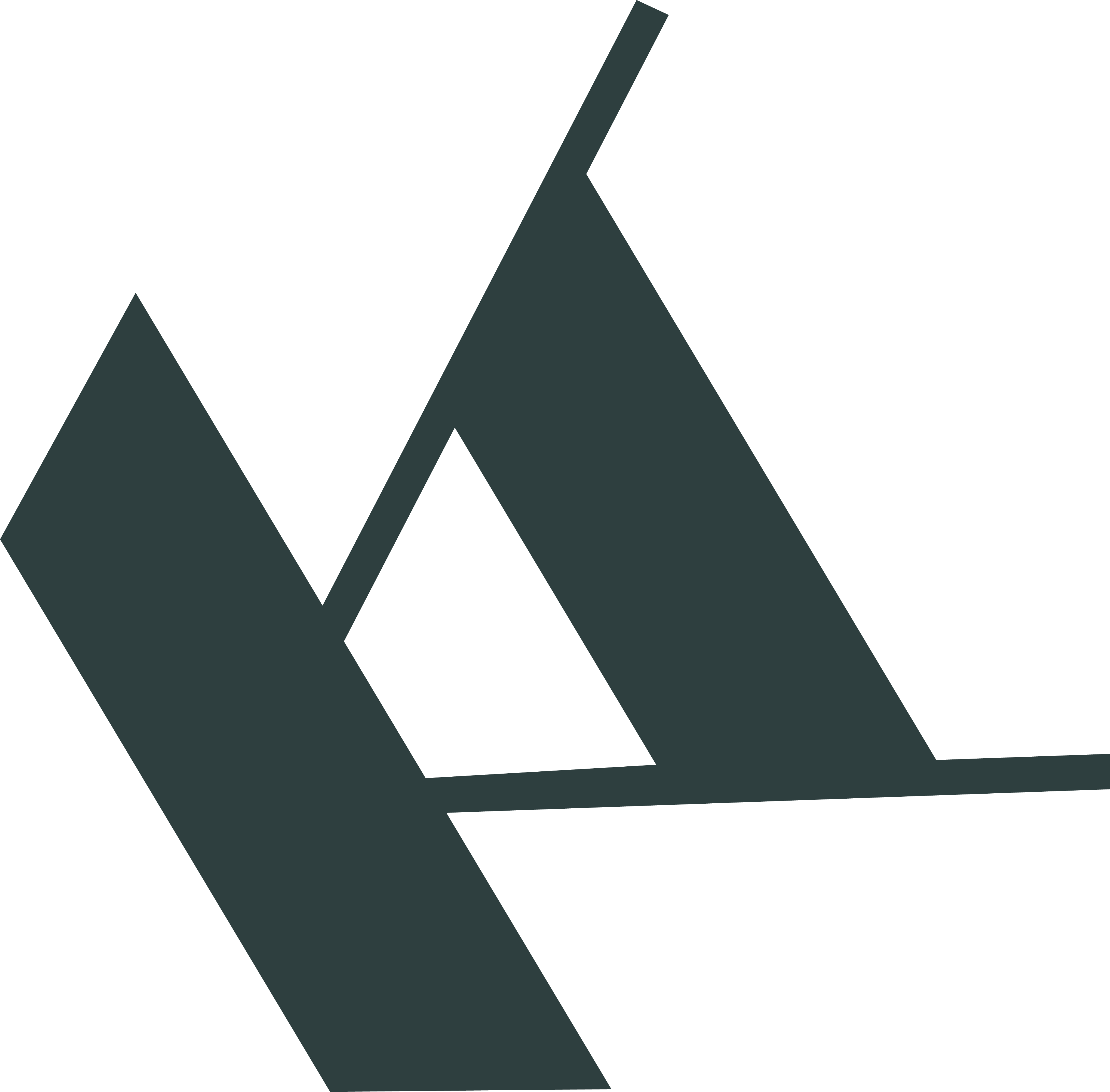
As a typographic project I created an alphabet of contrasts. Every letter is constructed in the ground form of a rectangle in proportion of two to four. The main design element that runs through design constantly is a right trapezoid. It gives any letter a unique weighting & stability. Every letter reaches its own character from thin additional lines, they are the skeleton of a letter. The contrast between the heavy trapezoid and the thin lines gives every letter a special dynamic, even when the letters are very static.
No matter how hard I try to construct a very geometrical letter to make it clear & calculable, in the end looking at the whole alphabet, it's easy to see the diversity of nature in the diversity of letters. It shows how much everything what we create is bound with nature.
No matter how hard I try to construct a very geometrical letter to make it clear & calculable, in the end looking at the whole alphabet, it's easy to see the diversity of nature in the diversity of letters. It shows how much everything what we create is bound with nature.
The font can be used in different contexts. Down here I used it as a decorative font for postcards from Rome. The pictures of postcards are pompous and magical. The constructed font gives the card the needed contrast and stands for modernity and clearness in the old city, filled with history.

