
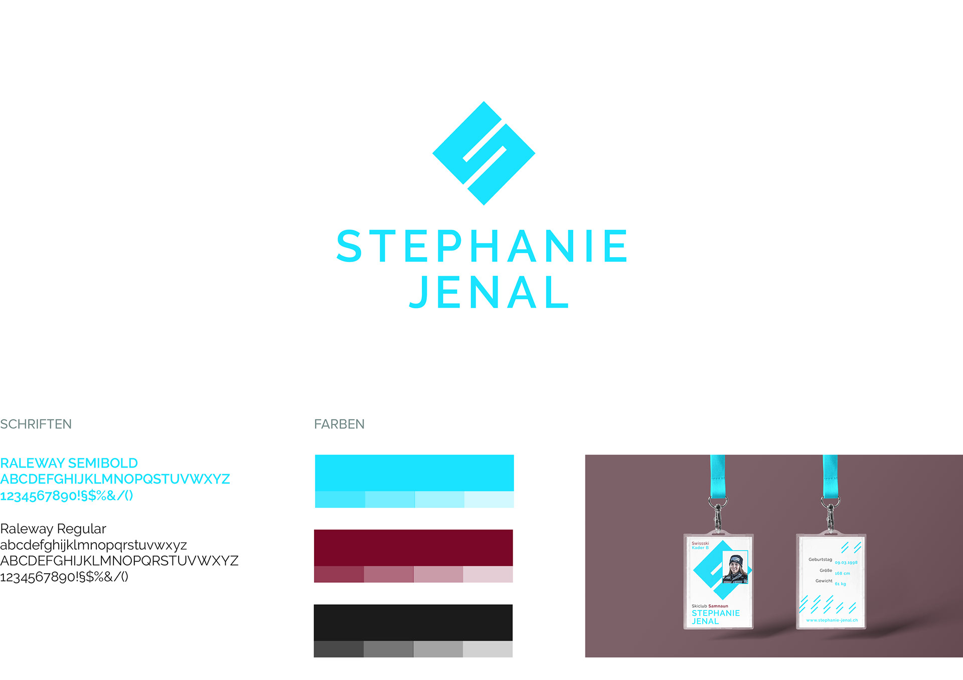
Stephanie Jenal is a young Swiss skier for whom I have crated a Logo and the CI around it. The logos ground form is a square. Square stands for balance and stability. Both qualities that are strongly needed in ski sport. The square is rotated by 45° giving it airiness and showing the movement while skiing. The dynamic of the logo is increased with two lines, which stand for fast driving skis and in at the end the letter "S" – the Initial of the name Stephanie. The logo is complemented with the whole Name of skier "Stephanie Jenal" to get a faster & better recognition factor.
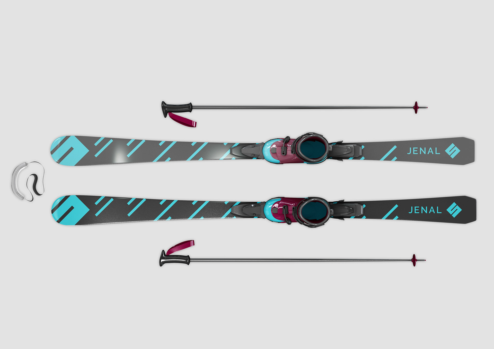
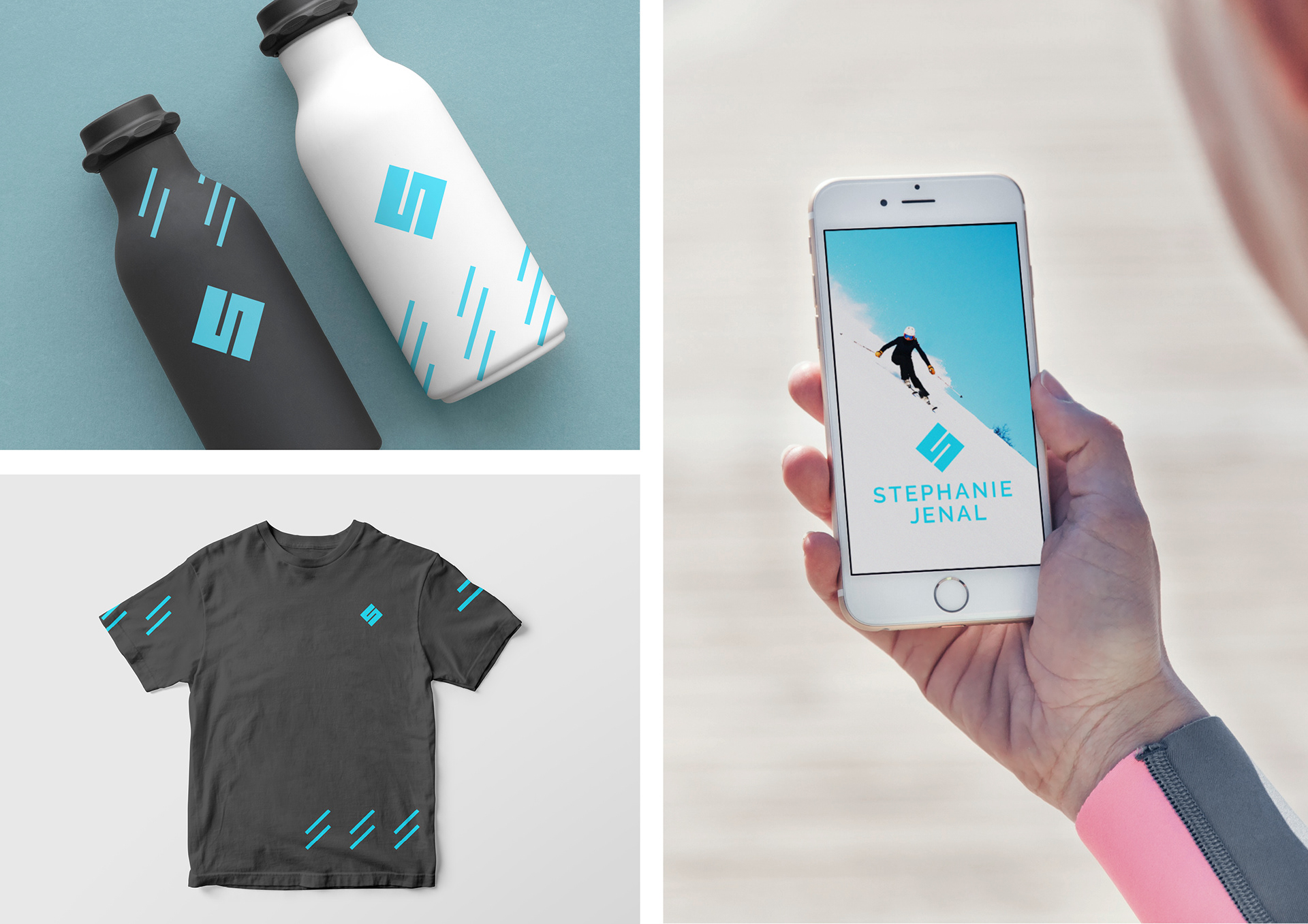
How could the brand "Stephanie Jenal" could look over different media you can see here.