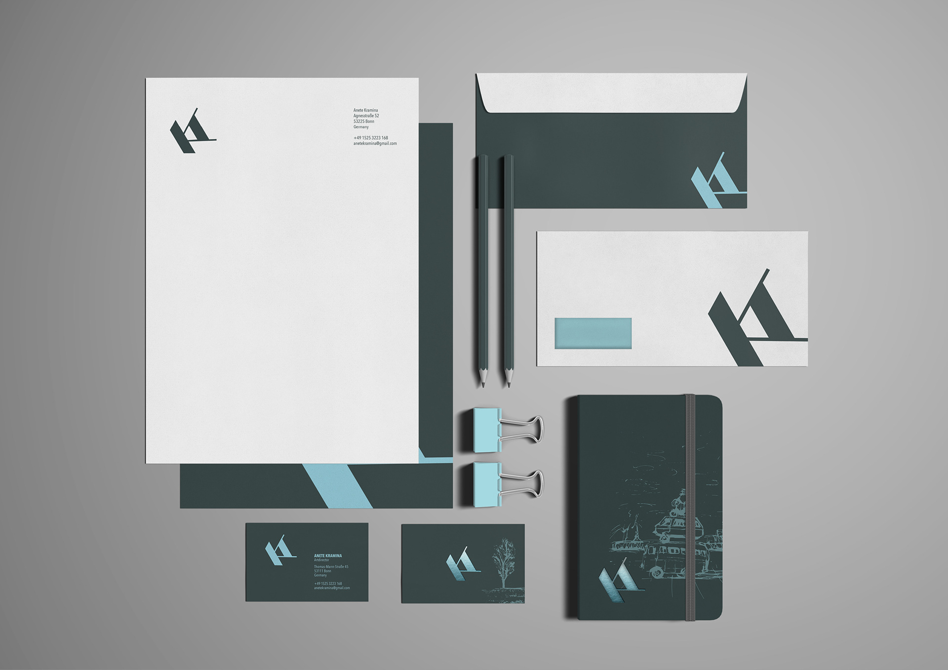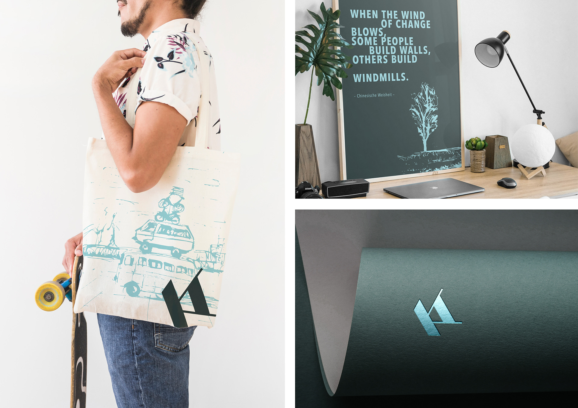

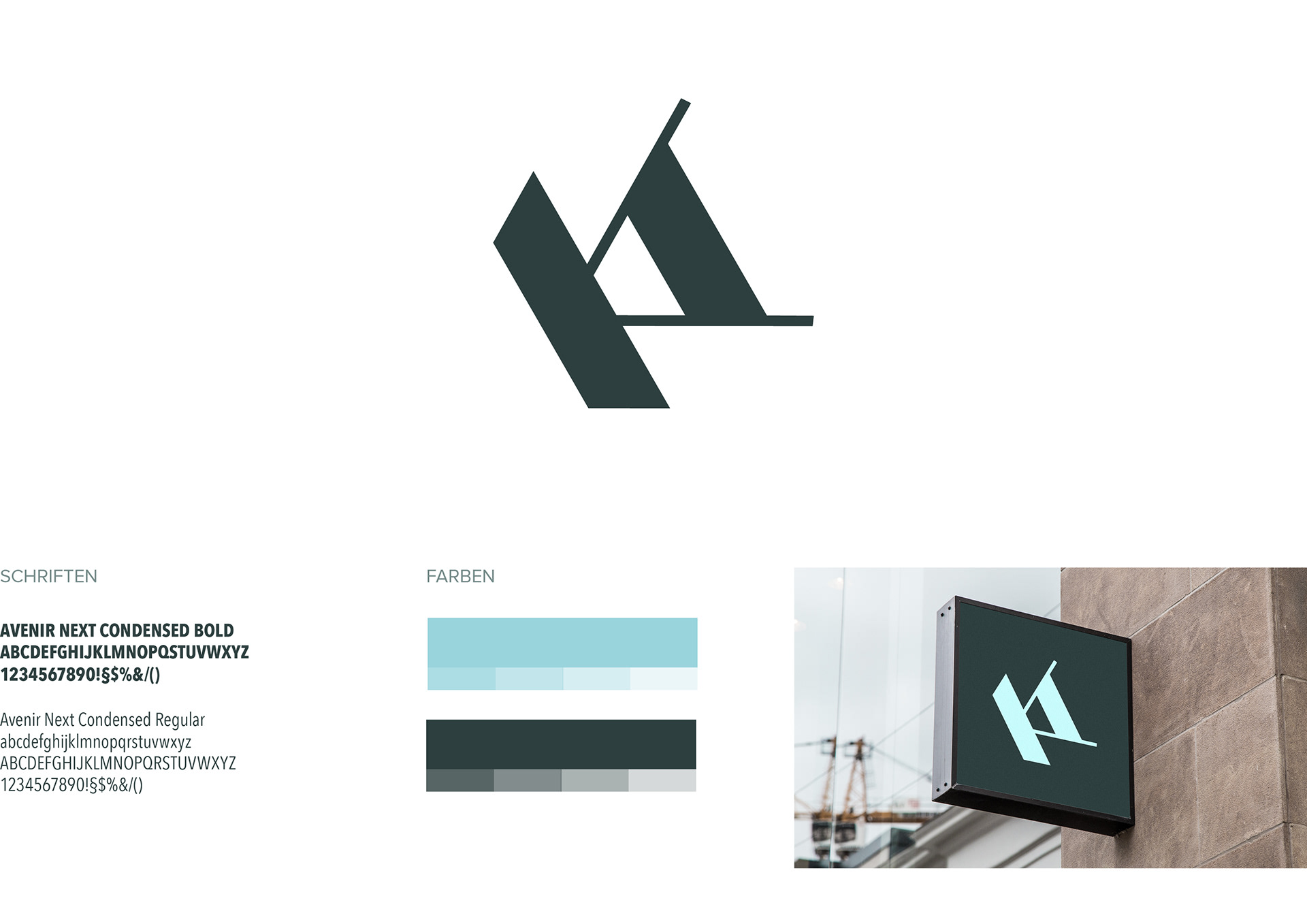
The corporate design for KA was developed from a Brief to create a logo for a designer with the initials KA. The Logo is geometric and dynamic which stands for precision, clarity and movement in the work of design. The contrast between bold forms and thin lines gives it, on the one side constancy and on the other side facility and to set something in motion. The corporate design of KA is a connection between clear geometric shapes in the logo, which are a contrast to the livelyhand-sketched illustrations. The iconic logo stands for "less is more", the clearness in design and the illustrations for the endless creativity.