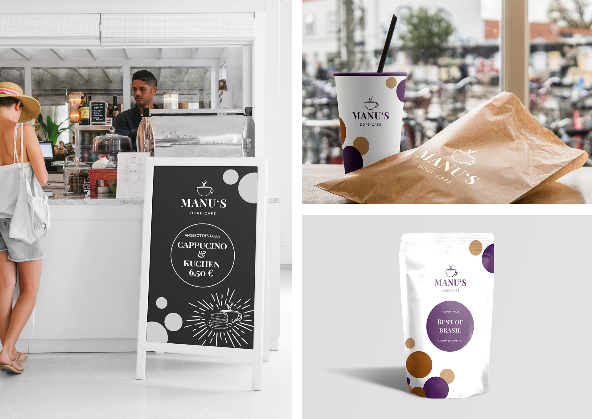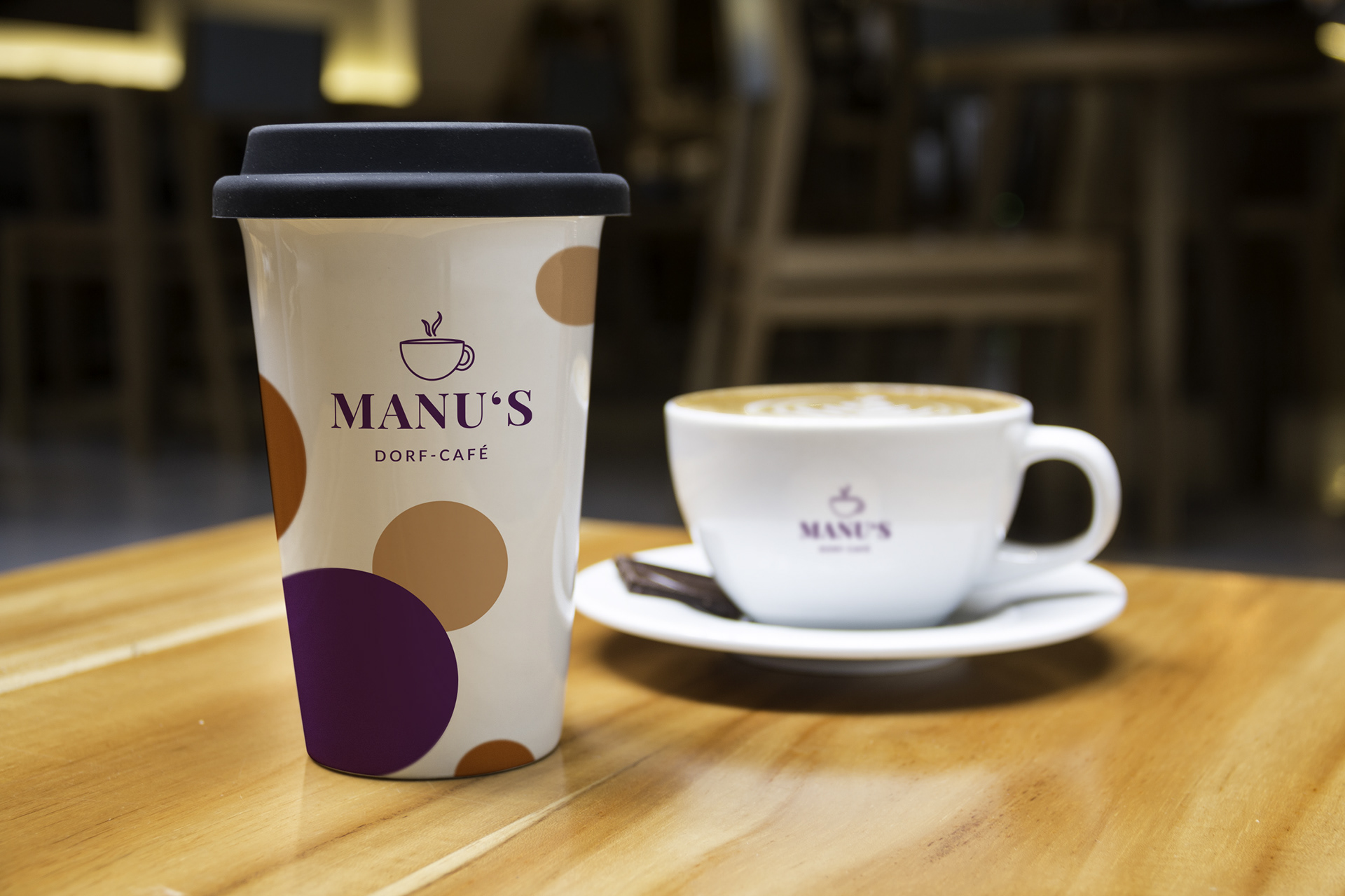

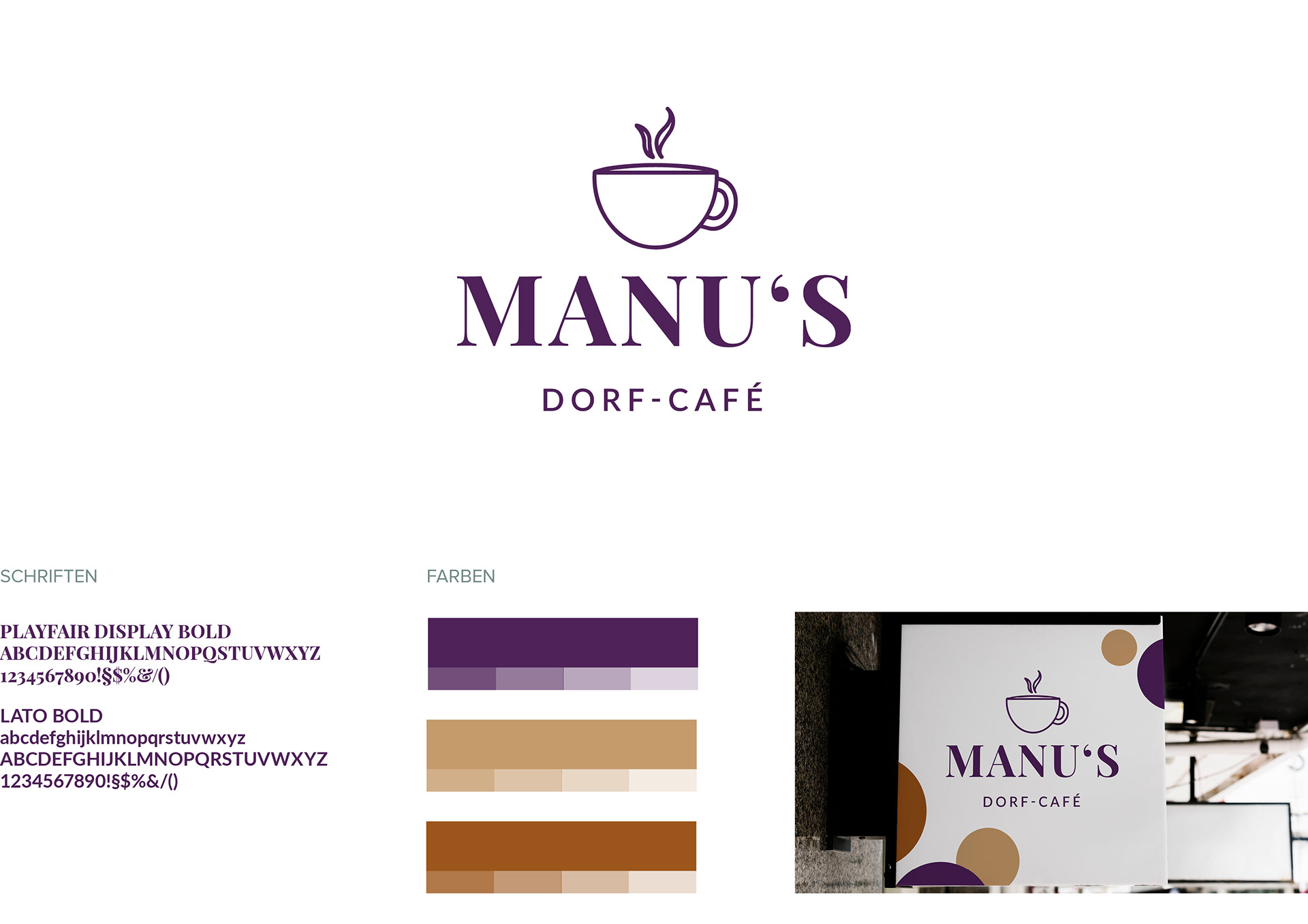
Manu's Dorf-Café is a corporate design for a small coffee shop in a village of Germany. Manu's coffee shop is the only one in the whole village and is located beside a well-known bikeway. It was therefore important to give a homelike feeling as well as a modern and fresh appearance.
For the logo I created a well visible and simplified coffee cup to show the relaxation of country life. I complemented it with the name of the coffee shop's owner to make a point of her kind personality. As the font I choose the playfair display bold. Whit its contrasty thin and bold parts in it, it make a perfect harmony between the light logo and the colourful pattern design.
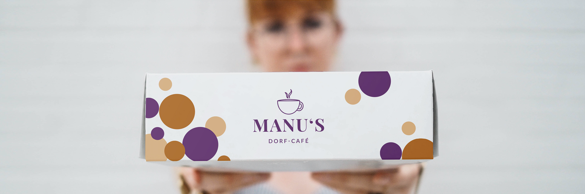
The colors of CD are violet and shades of brown. Violet because it is mainly associated creating an impression of luxury and extravagance. It's unique, individual, and independent. Brown because of its physiological meaning, it calms us down. It is present in everyday life, so it's kind, motherly, and protective. Both colours which reflect the spirit of manus café.
The circles pattern: In general, soft, round and organic shapes are less intimidating than pointed ones. They feel safe, friendly and inviting. Because of that i created a pattern which should bring liveliness in the Corporate Design. The pattern stands also for coffee beans, pastries and diversity of tastes.